Summary
I’ve finally moved my site off of WordPress and onto a static site, as well as a VPS. In this post I give my reasons for doing so and provide a tour of the new site.
Views my own. Discussion ≠ endorsement. Do try this at home.
bengoldsworthy.netNew Year, New Site
Screenshot by the author
~4,600 words
Published:
Last modified:
I’ve finally moved my site off of WordPress and onto a static site, as well as a VPS. In this post I give my reasons for doing so and provide a tour of the new site.
$$ \newcommand{\BibTeX}{\textsc{B\kern-0.1emi\kern-0.017emb}\kern-0.15em\TeX} $$Why bake your pages instead of frying? Well, as you might guess, it’s healthier, but at the expense of not tasting quite as good.
At long last, I’ve fulfilled a personal dream of moving my site off of WordPress and onto a static site, as well as hosting on a VPS. This has been a long time coming, so in this post I’ll detail the whys, the hows, the trials and tribulations, along with continuing my tradition of providing a new tour around the site each time I complete a major overhaul.
It should go without saying that this article will present the process in a much more neatly chronological order than is necessarily accurate: as this site is a part-time passion project, and I’ve been embroiled in some heavy-duty travelling, the reality was far more chaotic and piecemeal for much of the site’s development, with a lot more back-and-forth between the various stages (e.g., things I learnt about Hugo templating would influence my attempts to clean up my site content, which would in turn require alterations in the templating).
Ever since reading the late Aaron Swartz’ Bake, Don’t Fry back in early 2018, I’ve been keen to put his advice into practice.1 Swartz presented various valid advantages to serving a Web site as static files, such as ease of transfer between different hosting options and the creation of backups, as well as the ability to bulk search and modify my site content using the existing GNU utils like grep. However, unlike in 2002 when the post was written, we now live in the midst of the Website Obesity Crisis
(or, in more colourful terms, the era of the bullshit Web
), and concerns about site bloat, performance and tracking, as well as data siloisation and platform sovereignty, that were only beginning to appear on the radar at the time of his writing now present the key battlegrounds when it comes to securing the future of a Web worth having. Within this environment, the additional opportunites provided by a self-hosted static site have never been more crucial.
First, though, let’s look at the history of my Web presence. In all of its many guises, my site has been served dynamically; the original OhWhatOhJeez site comprised hand-written PHP page templates, and every subsequent iteration has been running on WordPress. This has been quite beneficial to me, as there remains a huge contracting market for someone with WordPress site administration experience (and having done Theme and Plugin development makes me look even shinier, even if all someone wants from me is to update a bunch of Plugins). That said, around the same time I was toying with the idea of shifting to a statically-generated site, WordPress introduced its post block editor Gutenberg as the default editor. This was not a popular move, and whilst there is a Classic Editor Plugin available, this was a stark lesson in the dangers of relying on a technology stack whose development direction is headed in a questionable direction. In 2021, Gutenberg was extended to provide full site editing, and I can say from experience that it is one of the most miserable Web experiences I have ever had.
I have always used this site as a playground to explore new technologies and approaches, and to improve my own skills as a developer. Despite the low stakes for the site, I always endeavour to make sure that this site is as standards-compliant as possible; whilst I’ve never met a professional role that cared about my encylopedic knowledge of HTML5’s semantic elements, you can look at the markup for this site to see my comprehensive use of <section>s, headers and suchlike.
I knew that, as part of the site redesign, I wanted to play around with several things:
!important! flags everywhere!);Lastly, along with shifting my site to a new platform I also wanted to switch from managed Web hosting to a VPS, which would also allow me to set up additional services on subdomains as part of a wider plan to move my data out of third-party silos and into systems which I control. To begin with, I knew that I wanted to move my code off of GitHub (with increasing urgency) and my media cataloguing out of the assortment of social cataloguing sites I’ve been using for around a decade (e.g., Amazon-owned Goodreads, which recently also helped confirm my decision by forcing through a shitty redesign).
So, with some free time on my hands, I finally decided to start working on it. I initially thought I wanted to build my own static site generator following the Unix philosophy and using a bunch of bash scripts chained together, but before long I decided I’d never get this done if I insisted on reinventing the wheel (no mattter how much of a good learning experience it might have been) and instead went for an established static site generator. It seemed like the frontrunners in the field were Hugo and Jekyll, with the former written in Go and banking on generation speed and the latter offering easier templating. I wanted to play around with a new templating language, had heard a lot about Go and felt like Hugo would be the more valuable tool to learn. Also, Hugo’s content-agnosticism seemed potentially more versatile than a more specifically blogging-focussed alternative like Jekyll, which would be necessary for my blog-cum-portfolio-cum-CV monstrosity.
First, I had to figure out how to export and convert all of my WordPress site content to the appropriate format for Hugo. This was no small order, as my WordPress site consisted of:
This all resulted in a wp-content/ folder of 1.4 GB, and a wp-content/uploads/ folder alone of 749.9 MB. Ooft.
The Hugo docs provide several tools for migrating data from WordPress. Of the three listed, one worked on the raw database export and one on the WordPress Exporter-created XML file, which meant both were off the cards as my site used a lot of post-hook formatting that I wanted to include in the exports (primarily for footnoting). As a result, I was left with Cyril Schumacher’s wordpress-to-hugo-exporter (itself a port of a previous WordPress-to-Jekyll exporter). However, as I’d kind of expected, this fell down when faced with my heavily-customised and media-heavy site. The former issue required me to tweak the Plugin to include custom Post Types and Taxonomies, whilst the latter required me to temporarily delete my Media Library to avoid a timeout.
My site has been hosted by OVH for a long as I can remember and, whilst they have always had solid uptime, their control panel interface is horribly clunky and unusable on underpowered devices or slow Internet connections. I was keen to move, and as a fresh new Ethical Consumer subscriber I also wanted to consider the environmental impact of my hosting provider—it’s all well and good making my site more efficient, but it wouldn’t amount to much if I didn’t then host it using a sustainable provider. After shopping around, though, I found that OVH had the best combination of environmental bona fides (with 77% of their electricity coming from renewable sources) and cheap VPS pricing, so I stuck with them despite their awful interface (reasoning that it would be less of a problem with a VPS, as I could just SSH into the server to do any administration).
That said, one of the advantages of shifting to a static site (as mentioned by Swartz) is that it becomes trivial to switch to a new server, so this is a decision that I intend to revist at a later date.
Whereas my past site updates have also come with major visual overhauls, in this instance I think I’m pretty much content with the site design and don’t see any compelling reason to drastically change it; it’s boring, and that’s the point. That works out fine, though, because I never actually got around to discussing my design considerations for the Omphaloskepsis Theme, so this can double as an ideal opportunity to finally do that.
In its most succinct telling, the design of the site you see befoe you is the result of me misremembering and misunderstanding the point of a joke from American Psycho. I was kicking around ideas for a new site design and for whatever reason I vaguely remembered the business card scene from that film. Wouldn’t it be a funny reference
, I thought, if my site was designed to resemble Paul Allen’s business card from that scene?
Then I re-watched the scene and realised that the whole point was that all of the business cards look identical, and Bateman’s descriptions of them are intentionally meaningless. So I wouldn’t be able to take a specific style from the scene, but the rough look stuck with me. And now here we are.
From this initial jumping-off point of off-white background, black text and stark borders
, additional inspiration came flooding in. Part of the aesthetic that I was trying to mimic is that of a paper newspaper, and I was particularly influenced by the Guardian’s newspaper-esque look, particularly its use of serif fonts. This was also around the time that Brutalist Web Design was first being talked about, and I found the Bloomberg site quite striking.2
In terms of information layout, I took a lot of inspiration from Wikipedia (specifically, the Vector 2010/Legacy Vector skin that was recently replaced with a new, shittier default), particuarly around the highlighting of external links and the post meta sections. As perhaps the closest equivalent to the multipurpose role of my own site, Gwern.net was a major influence in both style and layout.
Sites that I have found subsequent to completing the main design, which I consider to have sprung from similar priorities and which may have, in turn, fed back into tweaks to my own site, include Low-Tech Magazine’s solar-powered variant and Hundred Rabbits. Whilst I don’t think it particularly inspired anything in my current site, I take the success of Hacker News and its basic design as a reassuring counterpoint to the dominance of the Bullshit Web. Similarly, simplified versions of sites that are shitty by default, such as the semi-hidden old skin for Reddit or the alternative clients Teddit (for the same), Nitter (for Twitter) and Invidious (for YouTube).
From my own experiences of trying to navigate the Web using outdated and under-powered devices, I also like to apply a personal test of would this be a pain in the arse to navigate on the BlackBerry Classic?
Similarly, I like Cory Doctorow’s claim that Pluralistic is optimised for Netscape Navigator
(and I was also inspired by a Bryan Lunduke video about command-line Web browsers such as w3m, but it no longer seems to be available).
Lastly, one of the few things I can be proud of when it comes to the UK Government is the Government Digital Services (GDS)’s incredible work on GOV.UK, and both the GDS Blog and Inside GOV.UK are chock-full of gems, and I’ve taken huge inspiration from GOV.UK itself, various GDS posts and the Government Design Principles.
To begin with, I just wanted to match the style and functionality of my old site. As it turns out, this was pretty easy, with the biggest effort being the splitting of my monolithic 1,578-line stylesheet into a more cleanly-separated set of small SCSS files, following the 7-1 pattern as closely as possible. Also, I started working on the Omphaloskepsis Theme in 2018, and I’ve learnt a lot about frontend development since then, so I also reworked my stylesheets to use the BEM naming methodology.
Obviously, given that I am using an entirely new templating language, the template files for my old and new site look entirely different (e.g., compare the old site’s single post template with the new site’s). However, the resulting HTML looks largely the same, except much cleaner now (I don’t even know what some of the things in the WordPress HTML are, nor where they come from).
Another advantage of shifting to a static site generator, at least for my perfectionist self, is that I can now run Prettier over all of my output HTML files to ensure that they are nicely formatted and contain no errors, which wasn’t possible with the fried-on-demand WordPress pages. The difference is stark: just compare the markup from the old site with this output HTML (be sure to add view-source: before the URL in your Web browser) for the same post from the new one.
I did make a couple subtle design tweaks though, such as grouping the post meta section into a visually-distinct box and adding anchor links besides the section headings. For the most part, though, the site I produced looks almost identical to the old one:
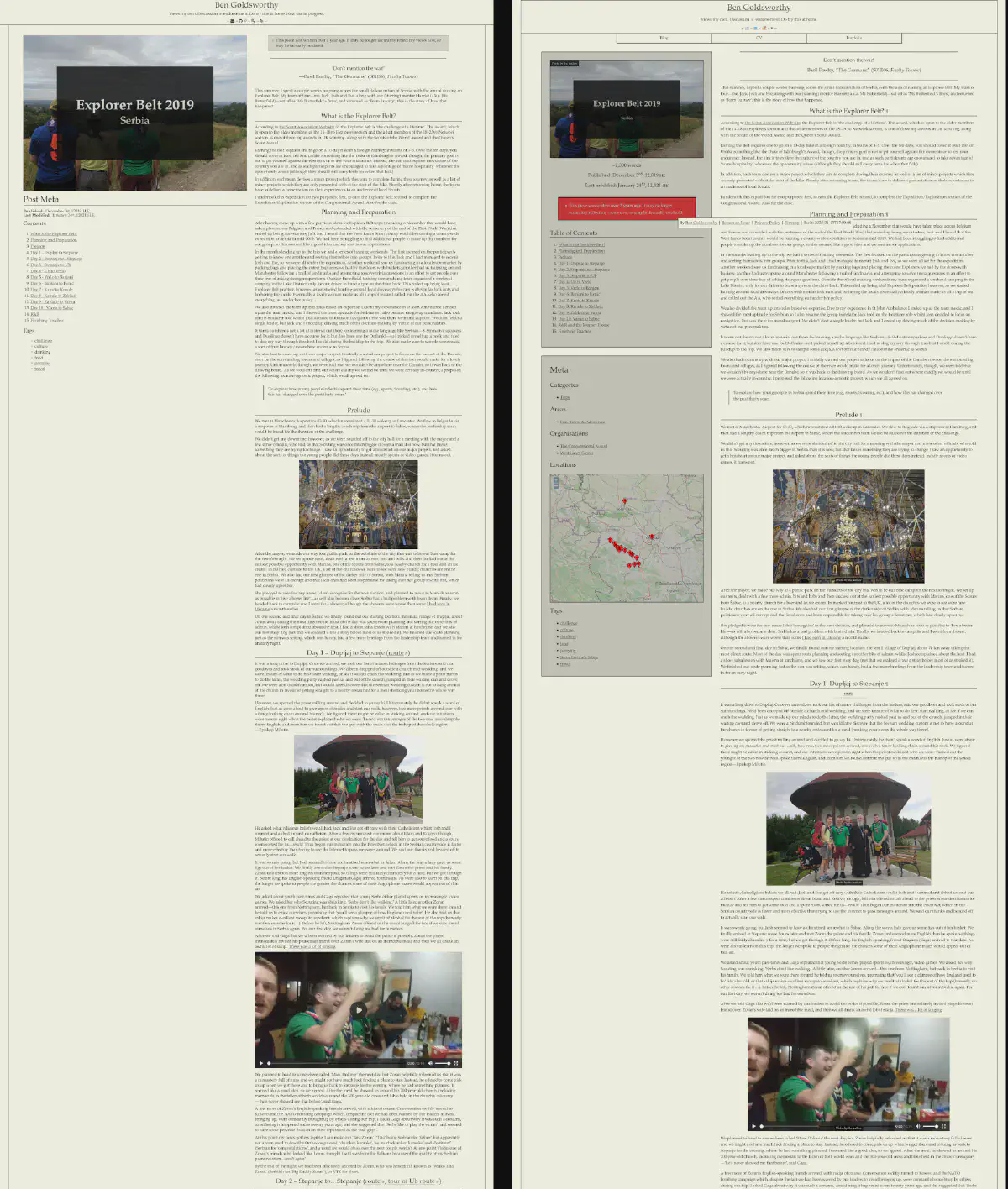
Screenshots by the author
The design of the single post page on the old site (left) and the new one (right)
Having pretty much achieved parity with my old site, it was now time to think about new features I wanted to add. One of these was the addition of new taxonomies, such as the Life Areas that I have started to use to organise myself (for an example of these in action, see my Review of 2022 post). I also changed how the locations were displayed, replacing the original unordered list into a map infographic using OpenLayers. Also on the topic of taxonomies, I am now starting to classify content by skills evidenced. Currently I’m generally just making up the skills as I go along, but where possible I am trying to align to specific frameworks (e.g., the SFIAplus IT skills framework from BCS or the CIISec Skills Framework specific to information security).
One very, very, very long-postponed project of mine has been to go back through all of my site content and ensure that images are properly attributed and have any relevant licensing information included. In addition, I want to ensure that every single image comes with alt text for accessibility reasons. Both of these were included in my efforts to convert all of my content into Page Bundles, which I’ll go into more later.
I also added some top-level Schema.org semantic markup to my site templates (e.g., here) and I have created a new citation shortcode that automatically applies this markup. Speaking of shortcodes, I also whipped one up for abbreviations (very much \( BibTeX \)-inspired) that I’m hoping to extend later into an automatic glossary generation step. Lastly, I added a post wordcount estimation.
Finally, I’m working my way up the IndieMark levels and now have a representative h-card and per-post h-entries added to my markup. Next step, Webmentions!
My use of automatic exporting tools no doubt saved me a huge amount of time and effort, but it left a wide range of bugs and quirks across the output files that required me to manually clean up. When I got lucky, these were easy enough to fix in bulk with some sed-fu, but sometimes there was no alternative to just manually going through every file and making alterations.
Some things were trivial, like replacing unwanted HTML entities (e.g., ’s) with the appropriate characters (e.g., apostrophes). Others were trickier, and would be reflexively informed by decisions I made as I learnt more about Hugo’s approach to content organisation.
As an example, take the following article frontmatter that was automatically exported (for this article):
---
title: Explorer Belt 2019
author: Ben
type: post
date: 2019-12-03T07:49:54+00:00
url: /2019/12/explorer-belt-2019/
featured_image: /wp-content/uploads/2019/12/explorer-belt-1200x900.jpg
Subtitle:
  - Serbia
ToC1:
  - 'What <em>is</em> the Explorer Belt?'
ToC2:
  - Planning and Preparation
ToC3:
  - Prelude
ToC4:
  - 'Day 1 - Dupljaj to Stepanje'
ToC5:
  - 'Day 2 - Stepanje to...Stepanje'
ToC6:
  - 'Day 3 - Stepanje to Ub'
[...]
categories:
  - Reports
---
The author, type and url parameters are unnecessary, as is the manually-defined list of section headings for the table of contents. Also, I had to standardise my custom parameters and convert their data types, such as turning the Subtitle parameter from a list of values into a single value and removing the initial capital letter. I also added additional taxonomies by which to organise my content, and want to convert all of my content into post bundles, and I wanted to neaten up the frontmatter itself with some vertical spacing.
The end result of my cleanup for the above article now looks like this:
---
# Meta
title: Explorer Belt 2019
subtitle: Serbia
summary: |
  "This summer, I spent a couple weeks traipsing across the small Balkan nation of Serbia,
  with the aim of earning an Explorer Belt. My team of four set off as ‘Ms Butterfield's Boys’,
  and returned as ‘Team Luxury’; this is the story of how that happened."
date: 2019-12-03T07:49:54+00:00
lastmod: 2021-01-24T00:00:00+00:00

# Resources
featured_image: explorer-belt
resources:
  - name: explorer-belt
    src: images/explorer-belt.*
    params:
      alt: Four people seen from by behind, looking out over the Serbian landscape
      attr: Photo by the author
  - [...]

# Taxonomies
organisations:
  - The Congressional Award
  - West Lancs Scouts
locations:
  - Banjani, RS
  - [...]
categories:
  - Trips
areas:
  - Fun, Travel & Adventure
skills:
  - fitness/hiking
  - travel/trip planning
  - social
tags:
  - challenge
  - culture
  - [...]
---
As I’ve mentioned, I wasn’t able to export my Media Library using the wordpress-to-hugo-exporter, and so had to manually copy my wp-content/uploads/ directory. By just sticking it directly into the static/ directory of my new Hugo site, I could ensure that all media links in the exported page content would still work, but this was only a temporary measure. Not only does the wp-content/uploads/ directory contain many duplicate resources, as well as multiple copies of each image at different sizes, but it also centralises every resource away from the content files.
As part of my move to Hugo, I wanted to convert every piece of content into a Page Bundle: a folder containing the content file and all of its raw resources, together in one place. Not only does this make each piece of content a single self-contained bundle (rather than separating content and resources), but by including resources as Page Resources rather than just statically-linked files I would gain access to Hugo’s image processing pipelines, meaning that I could store raw image files alongside page content, but resize them and convert them to a more Web-suitable image format on render, producing a smaller output filesize.
Initially, though, I wasn’t seeing the filesize reductions I was expecting. It took me a while, but I eventually discovered that you need to manually tell Hugo not to include the raw, unprocessed Page Resources in the output as well. The results were immediately impressive, knocking my non-page files
down from 760 to just 35 and the size of my output directory from 3.3 GB to 2.7 GB (and this with only a small number of my pages bundled so far).
For an example of an especially resource-heavy post, take the Explorer Belt article I highlighted earlier. After translating it over to my new site with the resources as-is, the whole page download came to 23.56 MB (with a fresh cache), compared to 22.45 MB for the old site’s version of the page. The actual size of all the resource files on the server, however, came to 47 MB. However, after converting the post into a Page Bundle (and, by extension, converting all of the image files into WebPs and wrapping them in <figure> and <picture> tags for extra points), this was reduced to 20.50 MB for the page download and 34.6 MB for the actual bundle files.3
Qualitative comparisons are one thing, but there are plenty of ways we can compare the old and new sites in more quantitative terms:
To begin with, my old site’s metrics were never very bad. For example, it scored highly on PageSpeed Insights (higher is better; old site figures translucent on the left, new site figures opaque on the right):
Note: Whilst I am still working on the site I am intentionally using an inefficient cache policy, which impacts on the ‘Performance’ score. I have also intentionally chosen to block search engines from indexing my site, which impacts the ‘SEO’ score.
I did have to manually enable several things that I had taken for granted due to WordPress automatically providing them; for example, text compression using Gzip.4 I also have a bunch of new improvements to add to my ever-growing to-do list, such as breaking up my stylesheet into ones specific to each type of page and their components to avoid making the user download unused styles, as well as enabling me to split out critical and non-critical styles, and only delay the initial page render whilst waiting for the former to download.
Similarly, a site accessibility assessment only showed up a few minor issues (lower is better except for ARIA, which is is neither inherently better higher or lower; ditto previous chart comment for the old and new site figures):5
However, most accessibility features can’t be tested for automatically, so watch out for the WCAG audit I plan to do at some point.
These both show the power of focusing on standards-compliant, efficient Web markup: I’ve ever really invested any time in improving my page speed or accessibility, and those decent scores were unintentional side-effects of ensuring that I was writing proper HTML, as we can see from the W3C HTML Validator (lower is better; ditto ditto):
That said, running these tests was also a good reminder for me that standards are ever-changing. Last time I looked, the HTML standard stated that the different levels of heading tags (<h1>–<h6>) were scoped only to the sections they are within; i.e., a Web site could have multiple <h1>s, provided there was only one per <section>, <article>, <aside>, etc. However, the document outline
algorithm that would have supported this was never adopted by browser developers, and after seven years of no progress the HTML 5.1 spec. advises to continue using only one <h1> header per page to guarantee accessibility.
My previous site achieved an A+ grade for its implementation of HTTP security headers from Security Headers (the highest available), and so I ensured that the new site achieved the same grade. I also took the time to remove some now-deprecated headers like Expect-CT and to add some new upcoming ones like Cross-Origin-Embedder-Policy.
My old site made requests to the following domains for content:
My new site only makes request to local content; there are no third-party requests. Where I have dependencies (e.g., the OpenLayers library used for displaying map visualisations) I download and locally host the scripts.
There is still a huge amount of work to do, from continuing to convert the remaining content into Page Bundles to updating past content to use things like my new citation shortcode. The CV tool is still in a rudimentary state, and I would like to conduct a full WCAG accessibility audit on the site in the near future. I haven’t yet taken a proper look at the format of the Atom feed for the site, so reading through the spec to see what features I can play with will probably be a large timesink. A dark theme for the site is also still a work-in-progress, and at some point I will probably buy a license for the Input Sans font for code samples.
I also still have a few features I haven’t even started looking into how to implement yet, such as Webmentions and an automated POSSE workflow, and I hope that Hugo introduces video processing pipelines in the near future (or, perhaps, I can have a go at adding them myself if I find the time).
As things stand, though, I finally have the lovely baked site that I’ve been thinking about for years. I also have a VPS, with all of the opportunities that gives me for hosting other services on different subdomains; I’ll talk about these in a later post.
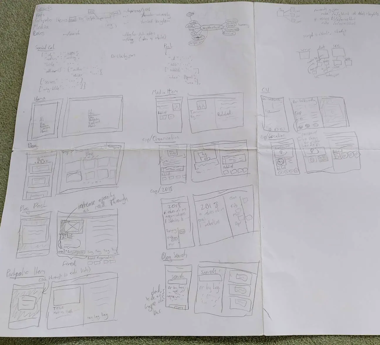
Here are some of my original design notes, which I’ve been lugging around ever since:
Photo by the author
Perhaps the more obvious newspaper site to compare to me own off-white, serif font site is that of the Financial Times, but I only encountered it well after I had finalised my own design. ↩︎
It’s worth noting, though, that 29.8 MB of this was a single video file, and Hugo currently does not have any automatic video processing features. ↩︎
I’d like to use Brotli, but currently this requires either a paid version of NGINX or expending more effort than I care to. ↩︎
This actually shows the value of validating your markup early and often: it turns out that I had been adding the alt text information for all of my newly-bundle Page Resources incorrectly, and so nothing was being rendered and my accessibility scores were suffering. I only realised this whilst writing this piece, and had to fix it by running the following RegEx over all of my Page Bundles:
s/(alt: .*)\n[ ]{4}(src: .*)\n[ ]{2}(params:)\n/\2\n \3\n \1\n/m
↩︎