Summary
When life gives you lemons…
Views my own. Discussion ≠ endorsement. Do try this at home.
A D.I.Y. guide for the discerning society Exec. member
Screenshot by author
~2,200 words
Published:
Last modified:
When life gives you lemons…
Gabe
You know what my mom used to say:
When life gives you shit,you just... Uh...Tycho
Make Shit-ade? What?
Gabe
Wait, it's coming to me.
So, the new LUSU website. Negativity is all well and good (and jolly cathartic), but what’s the point if you can’t suggest something better? With that in mind, this article will serve as a counterpoint to the other one. Where that article will be updated every time I discover some fresh new hell or minor annoyance on the site, this will be updated when I have a way to work around/break it.
On the society admin dashboard, one is graciously allowed to edit the Description
box for their society. The editor accepts WYSIWYG entry, or HTML. HTML like <style> tags. If you want to include these in your own society page, just switch to Source mode:
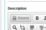
Click this
Then add some <style> and </style> tags and copy-paste away!
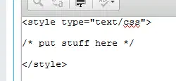
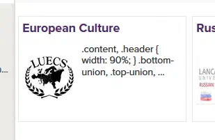
Note that you’ll want to put your intro line above the <style> tags, or your society listing will show up like this:
Anyway, here was the old page for LUECS:
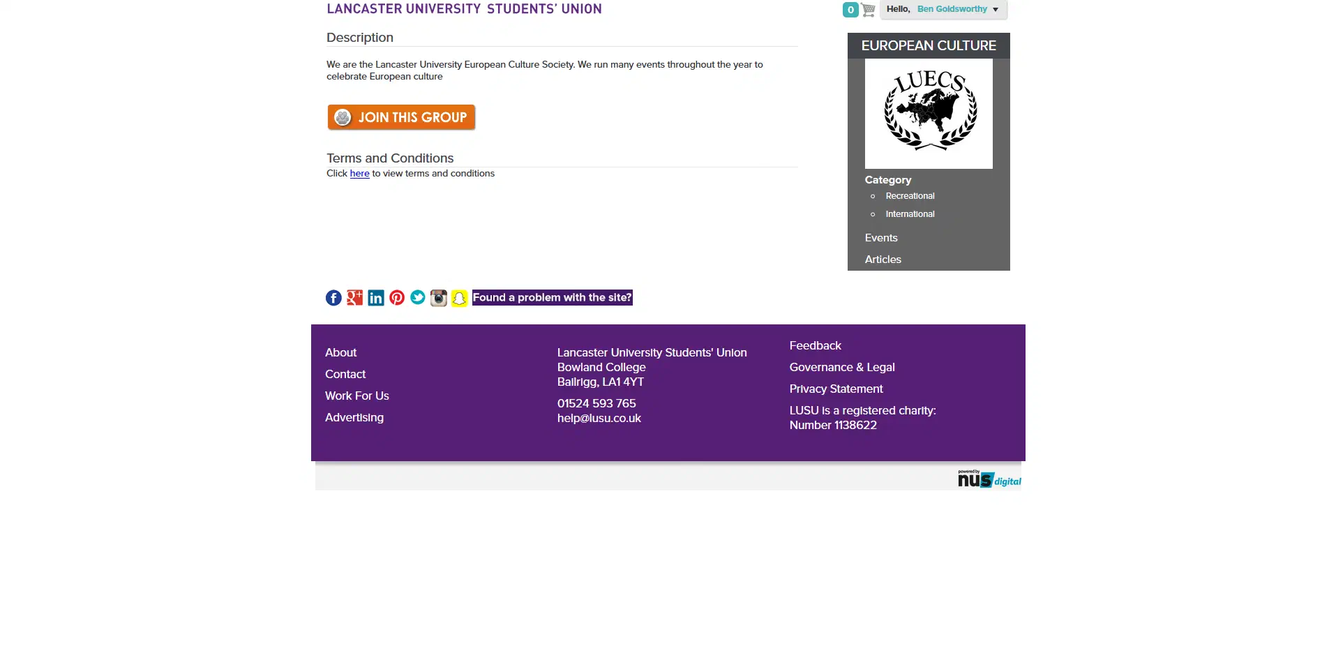
As you can see, it looks like pure, unmitigated bum. Here it is after a little bit of tinkering (and liberal use of !important CSS rules):
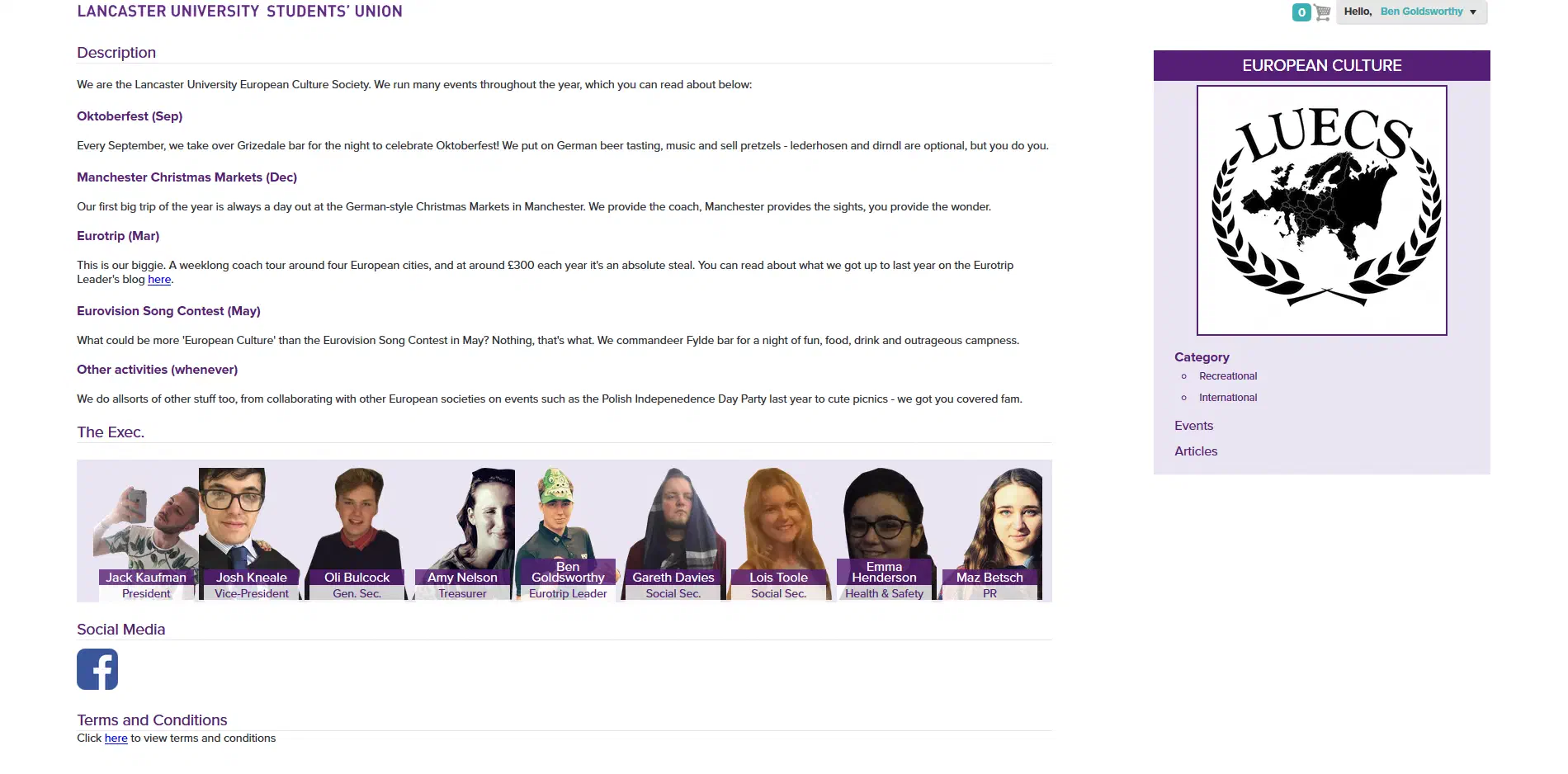
Much better, although there is still plenty to do. If you just want to copy what I’ve done and tinker with it, you can view the whole thing at the bottom by clicking here. In the article between here and there, I’ll go through each change step-by-step.
First and foremost, this fucker needed to go:

At first I just stuck on a filter: hue-rotate(225deg); to shift the inexplicable orange around the colour wheel to the closest I could get to purple, but it looked too bright and still left me with the rest of the button. No, it all had to go:
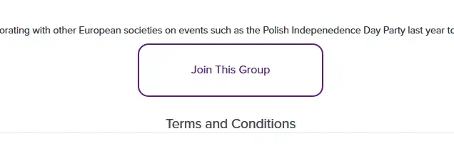
This was achieved with the following CSS rules (NB: it should go without saying that all of this CSS is bashed out through trial-and-error and thus a horrible mess that is about as CRAPL’d as it can be):
22.join-this-group.button-bottom {
23    width: 100% !important;
24}
25.join-this-group.button-bottom a {
26    margin: auto !important;
27    background: none !important;
28    text-indent: 0px !important;
29    border-radius: 15px;
30    padding: 8px 20px 8px 20px;
31    text-align: center;
32    color: #551F75;
33    border: 2px solid #551F75;
34    line-height: 40px;
35    text-decoration: none;
36    background-size: 100% 200% !important;
37    background-image: linear-gradient(to bottom, transparent 50%, #551F75 50%) !important;
38    transition: background .5s ease-in-out;
39}
40.join-this-group.button-bottom a:hover {
41    background-position: 0 -100% !important;
42    color: #fff;
43}
First, we make .join-this-group.button-bottom fullwidth so that we can position .join-this-group.button-bottom a in the centre of it with margin: auto !important;. We then purge just about every hint of the original button with the background: none !important; and bring the original button text back into view with text-indent: 0px !important;. Lines 8–17 create a far nicer CSS button around the <a> element, with 15–17 and 20 creating a nice hover-over slide transition. Notably, the button now transitions between LUSU purple (#551f75) and white — there is no fucking turquoise.
We’re living in a glorious new responsive design future, where people might be viewing a website on a desktop, a phone, a tablet, a phablet, a phesktop, a toaster, a tablone, etc. Central column designs are a holdover from the newspaper days and should be done away with as soon as possible. To do so, add these rules:
 5.content,
 6.header {
 7    width: 90%;
 8}
 9.bottom-union,
10.top-union,
11.uc-poweredby-nusdigital-logo {
12    width: 100%;
13}
14.uc-poweredby-nusdigital-logo-wrapper {
15    width: 100%;
16}
17
18.union-footer {
19    margin: 0;
20}
This stretches everything out to fill all of that lovely horizontal screen real estate that’s been ignored.
This one is more personal preference, but adding a quick
45.uc-poweredby-nusdigital-logo {
46    display: none;
47}
to your rules will hide that ugly NUS logo along the very bottom of the page, because why would you want to tout your affiliation to the world?
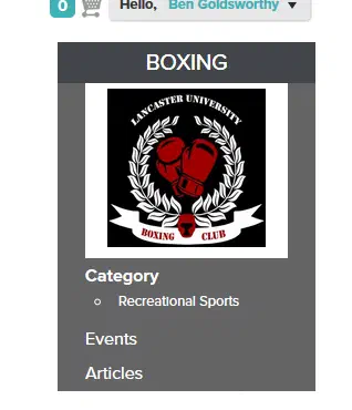
That info box on the right bumming you out with it’s grey-on-grey colour scheme? Try this CSS on for size:
49.title h1 {
50    background-color: #551F75 !important;
51}
52
53.thumbnail,
54.group-category,
55.group_left_panel_menu,
56.typeCategory {
57    background-color: #EAE5F2 !important;
58}
59
60.tree-navigation li,
61.tree-navigation li a,
62.tree-navigation h4 {
63   color: #551F75 !important;
64}
65
66.group-category {
67   padding-bottom: 6px;
68}
69
70.galleryIcon img {
71    border: 2px solid #551F75;
72}
To start with, we change the colours. I went for LUSU purple for the title bar along the top, and then got the whitened purple from the Your Officers
bar background (see blow) #EAE5F2 for the rest of the box (and, of course, making the text over it LUSU purple rather than white). Then I stuck a little padding on the bottom, because things were looking a bit too snug there for my liking. Finally, the white of the society logo suddenly giving way to the faded purple of the box looked bad, so I stuck a 2px LUSU purple border around the <img> tag.
I liked the look of all the headings being coloured in LUSU purple, rather than black. Simple:
71.content-wrap h1,
72.content-wrap h2,
73.content-wrap h3,
74.content-wrap h4,
75.content-wrap h5,
76.content-wrap h6 {
77   color: #551F75 !important;
78}
I then also took the rules from .contentBoxes h2 and applied them to <h2>s in general so that all your <h2> headings will look like the default Description
one at the top of the box:
79h2 {
80   background: none;
81   border-bottom: 1px solid #e6e6e6;
82   margin: 1.75% 0% 0%;
83}Okay, this one took some time but it was worth it. Step one was to get the HTML from the Your Officers
block on the homepage. All 257 lines of it.
What.
Want to know how they managed to make a simple ul of six lis stretch to 257 lines?

No…
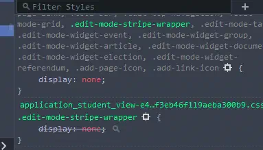
Unchecking a couple rules later, and:
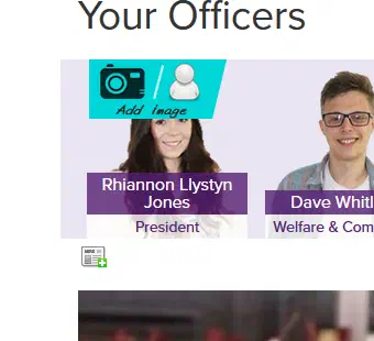
Like I said in the last article: it really is fractal. Regardless, that bloat clearly needs to get trimmed. Luckily for you, I’ve already done it. Here’s the HTML you’ll want to add to your page:
140<h2>The Exec.</h2>
141<div class="section stripe officersdesk" id="officers">
142   <div class="stripe-wrap" id="officers-wrap">
143      <div class="stripe-carousel officersdesk" id="officers">
144         <ul class="jcarousel-skin-tango edit-mode-stripe">
145            <!-- repeat block for each exec. member -->
146
147               <li>
148                  <span class="thumbnail-image"><img alt="POSITION HERE" src="IMG URL HERE" /></span>
149                  <span class="page-details"><span class="page-title">NAME HERE</span><span class="page-summary">POSITION HERE</span></span>
150               </li>
151
152            <!-- end repeat -->
153         </ul>
154      </div>
155   </div>
156</div>
Then add the following CSS, amending the width value for #officers a with the result of \( \left\lfloor\frac{1}{A} \times 100\right\rfloor \), where \( A \) is the number of Exec. members you have:
 85.thumbnail-image img {
 86   height: 160px;
 87   width: 160px;
 88   object-fit: cover;
 89   object-position: 0 50%;
 90}
 91
 92#officers a {
 93   width: WIDTH HERE% !important;
 94   float: left;
 95}
 96
 97#officers li {
 98   width: 100% !important;
 99}
100
101#officers {
102   overflow: hidden !important;
103   margin-top: 10px;
104}
Now for the excruciating part: uploading the images. On the website backend, click the Add Image
button and then the Upload
tab:

This one
Upload your photo and wait five years or so for it to finish. Then, click the Image Info
tab, followed by the Browse Server
button. Click the image you just uploaded, and then OK
. In the URL
box will be the URL for your photo — copy it and paste it into your HTML where it says Image URL here
:

Copy this
Repeat this process, add names and job titles and Bob’s your uncle.
You’d be forgiven for thinking that adding social media links on the backend would cause them to appear on the frontend. Nope, it’s another DIY job. First, the HTML:
159<h2>Social Media</h2>
160<ul class="social-media">
161   <!-- repeat block for each social media account -->
162
163      <li>
164         <div class="icon" style="background-image: url('IMG URL HERE');"></div>
165      </li>
166
167   <!-- end repeat -->
168</ul>
To style it, we set up the ul to remove the bullet points, remove its left-margin so it sits flush with the rest of the page and add an :after rule that clears the float rule that we bring in for all its child list elements to make them align horizontally:
103.social-media {
104   list-style: none;
105   margin: 10px 0 10px 0 !important;
106}
107
108.social-media:after {
109   content: '';
110   display: block;
111   clear: both;
112}
113
114.social-media li {
115   float: left;
116}
Then we just add some styling to the icons themselves, and a nice bevel :hover effect:
115.icon {
116   height: 50px;
117   width: 50px;
118   border-radius: 10px;
119   background-size: cover;
120   background-repeat: no-repeat;
121   background-position: center center;
122   cursor: pointer;
123   margin: 5px 10px 5px 0x;
124}
125
126.icon:hover {
127   -moz-box-shadow: inset 0 0 10px #000000;
128   -webkit-box-shadow: inset 0 0 10px #000000;
129   box-shadow: inset 0 0 10px #000000;
130} 1<p>Lorem ipsum dolor sit amet, consectetur adipiscing elit, sed do
2eiusmod tempor incididunt ut labore et dolore magna aliqua.</p>
3
4<style type="text/css">
5 .content,
6 .header {
7 width: 90%;
8 }
9 .bottom-union,
10 .top-union,
11 .uc-poweredby-nusdigital-logo {
12 width: 100%;
13 }
14 .uc-poweredby-nusdigital-logo-wrapper {
15 width: 100%;
16 }
17
18 .union-footer {
19 margin: 0;
20 }
21
22 .join-this-group.button-bottom {
23 width: 100% !important;
24 }
25 .join-this-group.button-bottom a {
26 margin: auto !important;
27 background: none !important;
28 border-radius: 15px;
29 text-indent: 0px !important;
30 padding: 8px 20px 8px 20px;
31 text-align: center;
32 color: #551F75;
33 border: 2px solid #551F75;
34 line-height: 40px;
35 text-decoration: none;
36 background-size: 100% 200% !important;
37 background-image: linear-gradient(to bottom, transparent 50%, #551F75 50%) !important;
38 transition: background .5s ease-in-out;
39 }
40 .join-this-group.button-bottom a:hover {
41 background-position: 0 -100% !important;
42 color: #fff;
43 }
44
45 .uc-poweredby-nusdigital-logo {
46 display: none;
47 }
48
49 .title h1 {
50 background-color: #551F75 !important;
51 }
52
53 .thumbnail,
54 .group-category,
55 .group_left_panel_menu,
56 .typeCategory {
57 background-color: #EAE5F2 !important;
58 }
59 .tree-navigation li,
60 .tree-navigation li a,
61 .tree-navigation h4 {
62 color: #551F75 !important;
63 }
64 .group-category {
65 padding-bottom: 6px;
66 }
67 .galleryIcon img {
68 border: 2px solid #551F75;
69 }
70
71 .content-wrap h1,
72 .content-wrap h2,
73 .content-wrap h3,
74 .content-wrap h4,
75 .content-wrap h5,
76 .content-wrap h6 {
77 color: #551F75 !important;
78 }
79 h2 {
80 background: none;
81 border-bottom: 1px solid #e6e6e6;
82 margin: 1.75% 0% 0%;
83 }
84
85 .thumbnail-image img {
86 height: 160px;
87 width: 160px;
88 object-fit: cover;
89 object-position: 0 0;
90 }
91 #officers a {
92 width: 100% !important;
93 float: left;
94 }
95 #officers li {
96 width: 11% !important;
97 }
98 #officers {
99 overflow: hidden !important;
100 margin-top: 10px;
101 }
102
103 .social-media {
104 list-style: none;
105 margin: 10px 0 10px 0 !important;
106 }
107 .social-media:after {
108 content: '';
109 display: block;
110 clear: both;
111 }
112 .social-media li {
113 float: left;
114 }
115 .icon {
116 height: 50px;
117 width: 50px;
118 border-radius: 10px;
119 background-size: cover;
120 background-repeat: no-repeat;
121 background-position: center center;
122 cursor: pointer;
123 margin: 5px 10px 5px 0x;
124 }
125 .icon:hover {
126 -moz-box-shadow: inset 0 0 10px #000000;
127 -webkit-box-shadow: inset 0 0 10px #000000;
128 box-shadow: inset 0 0 10px #000000;
129 }
130</style>
131
132<p>Lorem ipsum dolor sit amet, consectetur adipiscing elit, sed do
133eiusmod tempor incididunt ut labore et dolore magna aliqua. Ut enim ad
134minim veniam, quis nostrud exercitation ullamco laboris nisi ut aliquip ex
135ea commodo consequat. Duis aute irure dolor in reprehenderit in voluptate
136velit esse cillum dolore eu fugiat nulla pariatur. Excepteur sint occaecat
137cupidatat non proident, sunt in culpa qui officia deserunt mollit anim id
138est laborum.</p>
139
140<h2 class="subheading">The Exec.</h2>
141
142<div class="section stripe officersdesk" id="officers">
143 <div class="stripe-wrap" id="officers-wrap">
144 <div class="stripe-carousel officersdesk" id="officers">
145 <ul class="jcarousel-skin-tango edit-mode-stripe">
146 <!-- repeat block for each exec. member -->
147
148 <li>
149 <span class="thumbnail-image"><img alt="POSITION HERE" src="IMG URL HERE" /></span>
150 <span class="page-details"><span class="page-title">NAME HERE</span><span class="page-summary">POSITION HERE</span></span>
151 </li>
152
153 <!-- end repeat -->
154 </ul>
155 </div>
156 </div>
157</div>
158
159<h2 class="subheading">Social Media</h2>
160
161<ul class="social-media">
162 <!-- repeat block for each social media account -->
163
164 <li>
165 <div class="icon" style="background-image: url('IMG URL HERE');"></div>
166 </li>
167
168 <!-- end repeat -->
169</ul>