Summary
It’s all gone a bit Pete Tong.
Views my own. Discussion ≠ endorsement. Do try this at home.
Found a problem with the site?
Everything that’s wrong with the new LUSU website
Screenshot by author
~1,600 words
Published:
Last modified:
It’s all gone a bit Pete Tong.
Fractal Wrongness: The state of being wrong at every conceivable scale of resolution.
I may have made my thoughts on the new NUS Digital/UnionCloud-based LUSU website, brought in for the start of the 2016/17 academic year, known previously. I may have said that one day, I’ll learn to stop giving the NUS even the slightest modicum of credit
, and described UnionCloud as a CMS only its mother could love
. Hardly high praise.
But then I had to actually use the damn thing, in all its fractal, fractal wrongness.
Now, I won’t lie — I wasn’t involved in the development process. I don’t know just how much one is given by the NUS to work with. However, UCUM’s SU are on the same system: check it out. They were on it back at the end of last year, so perhaps these issues are just teething problems that UCUM worked out whilst I wasn’t looking. In that case, consider this a public service announcement. No names named, no beefs: just a professional suggestion (or ten).
Because frankly, this is the most superfluous button I’ve ever seen:
This article won’t be a publish & forget kinda deal either, I’ll update it every time I come across a new issue. Expect many updates. Some will be nitpicks, some will be great big security vulnerabilities, some will just be personal aesthetic quibbles. All will have gotten on my tits at least once. Without further ado:

LUSU has a quite nice shade of purple (#52237f, to be precise) to call its own. Colours that go with purple? Complementarily, yellow. Analogously, pink or dark blue. Triadically, orange and dark green. Tetradically, red, green and yellow. Do you know what all those colours have in common?
They’re not fucking turquoise.
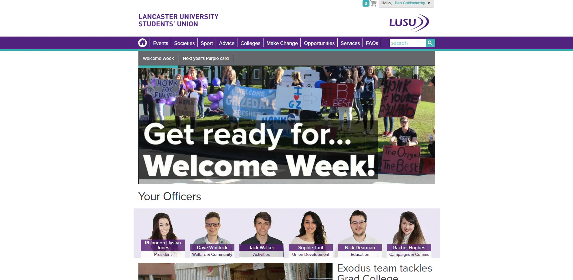
Y’know, there’s a reason achieving this kind of layout is called the Holy Grail of web design. That’s not an excuse to just leave ½ of the page blank.
The top looks like this:

The bottom looks like this:

Fine. Cool. Whatever.
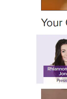
Even with that, the Your Officers
bar extends beyond the boundaries of everything else. Was it intentional? Was it a mistake? There’s no way to know, for both seem as one when it comes to the LUSU website.
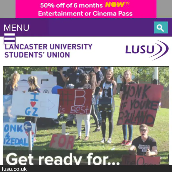
Silky smooth
Like poetry, really.
Your Officersblock 
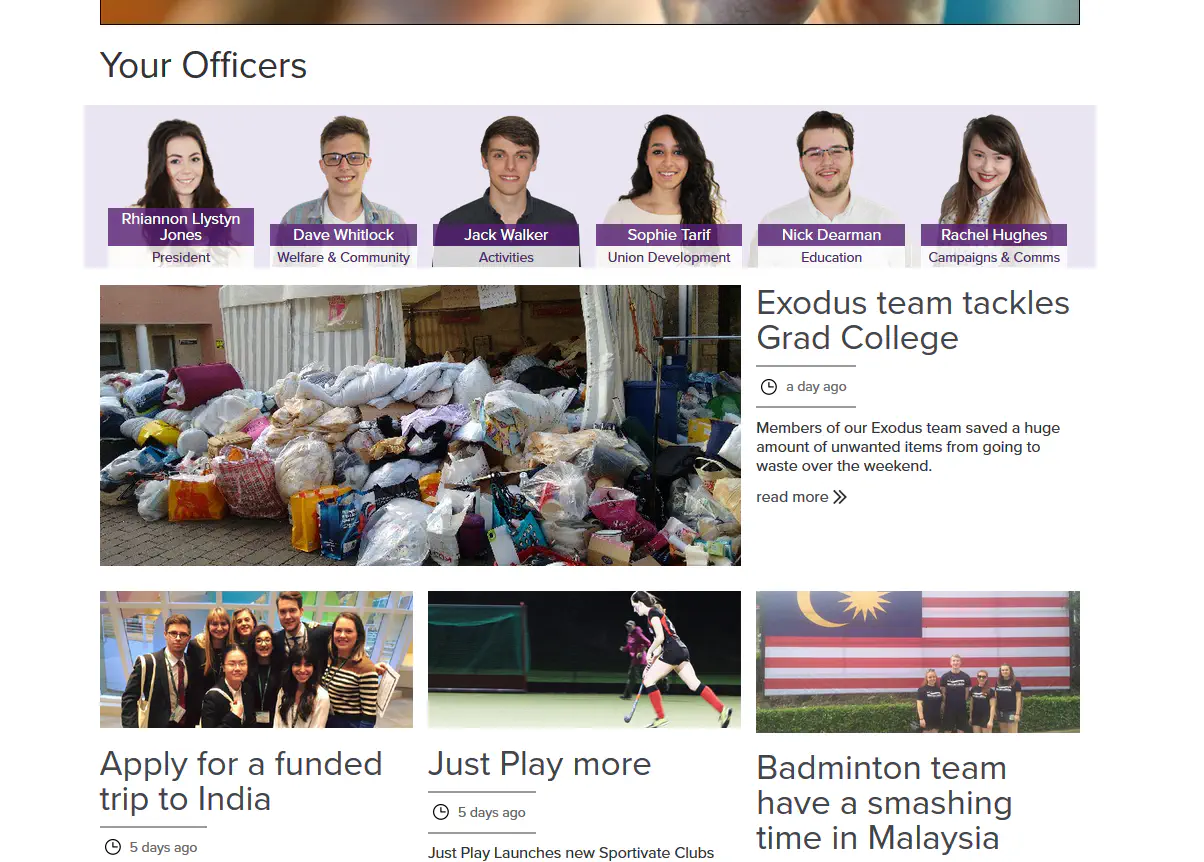
When you see a layout like that, and the highlighting of the President on the left there, what do you assume? I even did bloody training for this thing, and I still assumed clicking the other officers would restrict the articles below them to ones from their area of expertise.
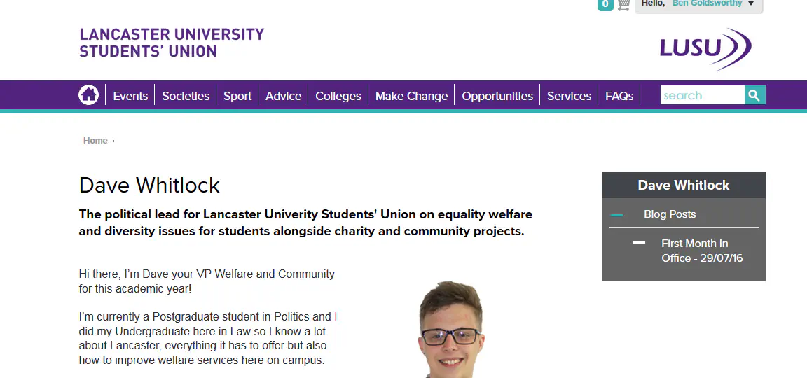
Nope
Website Trainingis still a category 

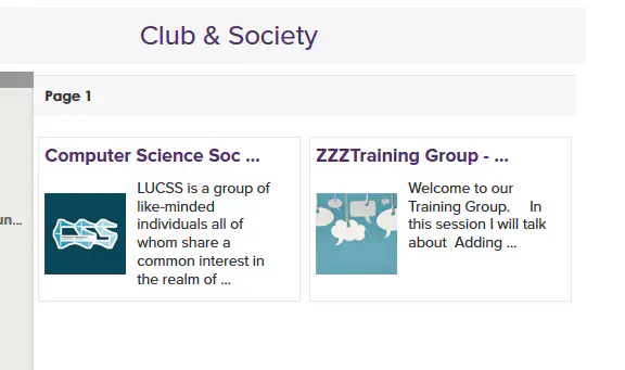

;_;

How come I only seem to exist as a product of the sum of my society exec. memberships? Where’s the page for Ben Goldsworthy, student? I’m a human being, man!
I mean, there is a page for entering in details and a profile picture. There just doesn’t seem to be any directory of students or anything that’d make that worthwhile.
You can attach your social media accounts though!

Y’know, maybe
Now you see it:
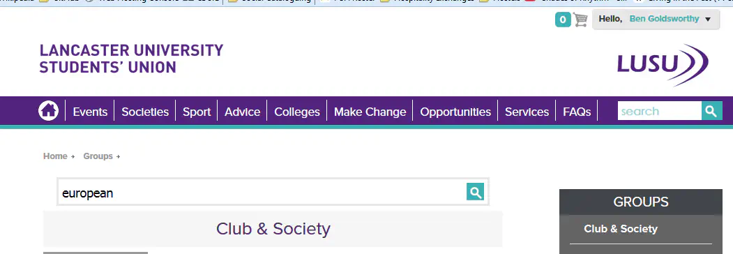
Now you (view a club or society and) don’t:

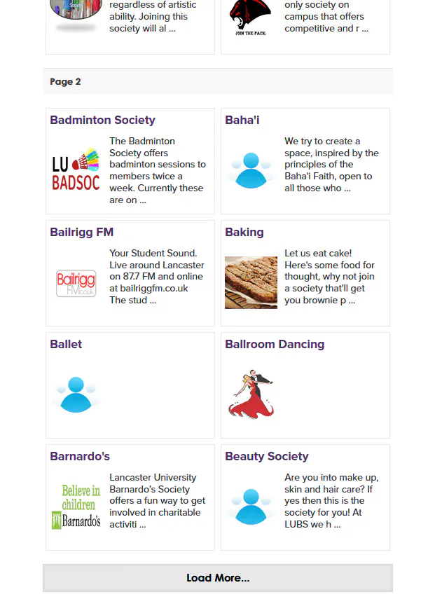
Infinite scrolling is supposed to replace indexed pages. If your Load More
button
you have no benefits of either method of navigation.
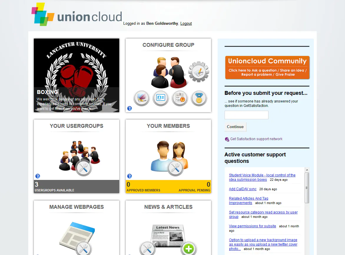
I would write exactly why this is hideous, but I’m busy throwing up in my mouth and also everywhere else.
Okay, so this is where things get a little technical (although to be fair, why are you reading me whinge about web design if you aren’t willing to slog through a bit of that?). This is the button on the society information pages:

It looks like arse and doesn’t fit the website in any way, shape or form, right?
Here’s its CSS:
.join-this-group.button-top a,
.join-this-group.button-bottom a {
    background: url("default/jointhisgroup-button.png")
                no-repeat scroll left top transparent;
    display: block;
    height: 41px;
    overflow: hidden;
    text-indent: -999px;
    width: 216px;
}
Oh shit bruv, what you doin'?
Ignoring briefly the use of a background-image for the button, the initially overlooked text-indent: -999px; caught my attention. Was someone having a giggle? I changed it to text-indent: -80px;, bringing whatever it was that was being shoved 999 pixels over to the left rightward. Lo and behold:
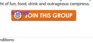
This is the strangest way of doing a button I’ve ever seen, but it got me thinking. Another article
kind of thinking.
As the Wu-Tang Clan famously sang, XSS ain’t nothin’ to fuck with
.
Submitbutton on the issue reporting form disappearing if you enter something incorrectly 
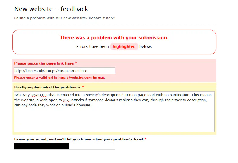
I’m just trying to tell you about how massively vulnerable your website is, why must you make it so difficult?
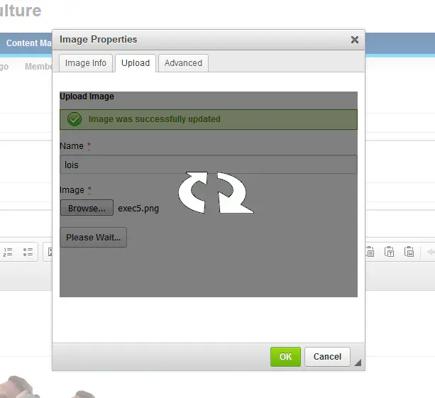
I timed it. It took 26 s to upload a 416 KiB .png. That means we’re working on 16 KiB/s. Jesus wept.

What makes attributes of type ID special is that no two such attributes can have the same value in a conformant document, regardless of the type of the elements that carry them; whatever the document language, an ID typed attribute can be used to uniquely identify its element.
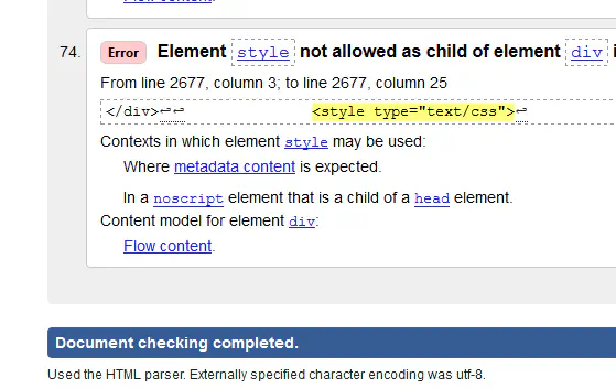
.thumbnail,
.group-category,
.group_left_panel_menu,
.typeCategory {
    background-color: #915BB1 !important;
}
That is an actual CSS rule I had to write. Hyphenated, underscored and camelCased class names all together. It’s anarchy.
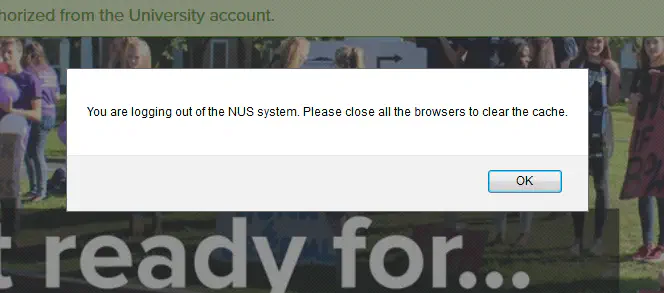
No u
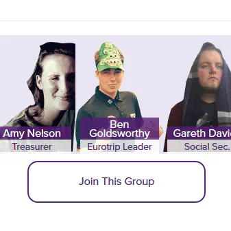
Surely there’s a middleman that could be cut out here
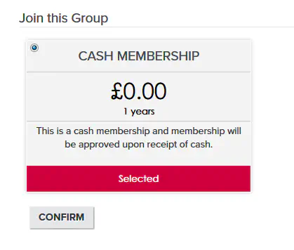
Is this really the only way of creating a free membership?
Okay, so LUECS’ is https://lusu.co.uk/groups/european-culture, which makes sense. What about LUB?

Yeah ‘cause that’s intuitive.
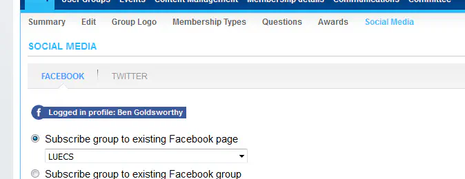
What’s the point, if no link gets added to the society page?
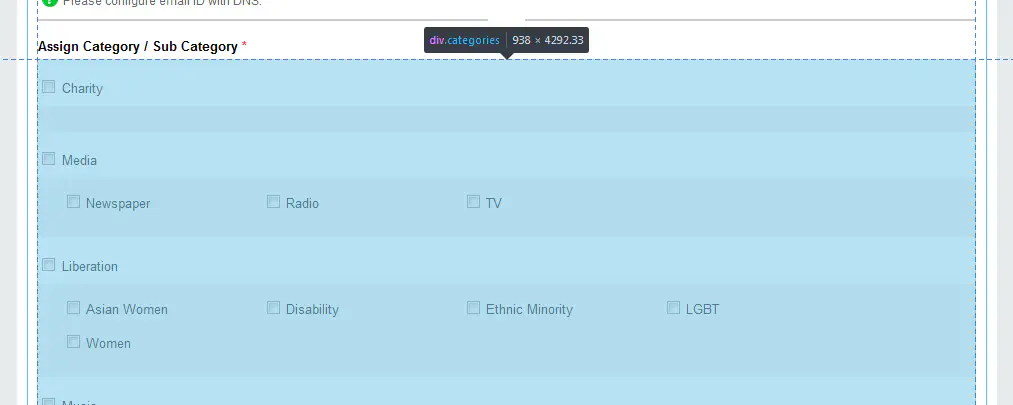
Every single category and every single child category, all standing between you and the Save & Approve
button at the bottom. No means of collapsing the list. Let’s do this.
On the bright side, you do get some amusement as you scroll. For example, the juxtaposition of Fetish
and First Aid
(not to mention Darts
— is someone from Pendle College behind this?):

.clear elements

They have one rule: clear: both;. Just stick it on an :after and clear up your HTML.
Specifically this small, unstyled See more
:

So you’re looking through the list of ideas and see one you feel strongly about. Intuitively, you’d probably click one of the thumbs:
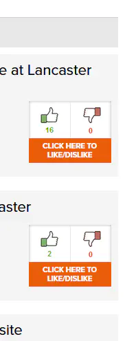
Then nothing would happen, and you’d look closer, finally seeing that orange block on the bottom. Yes, you have to click that to get to the idea’s page, where you can click the thumbs to vote (or the incredibly superfluous orange text underneath works too):
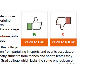
Want to know where this is particularly egregious? On the website homepage, this is what you get:
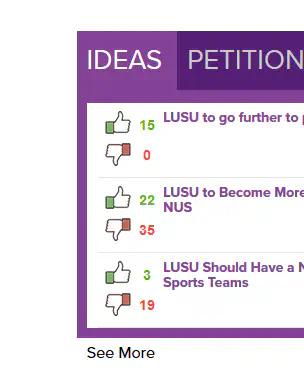
And of course, the whole block with the thumbs and the tallies for both responses is just one big link to the idea’s page. Of course.
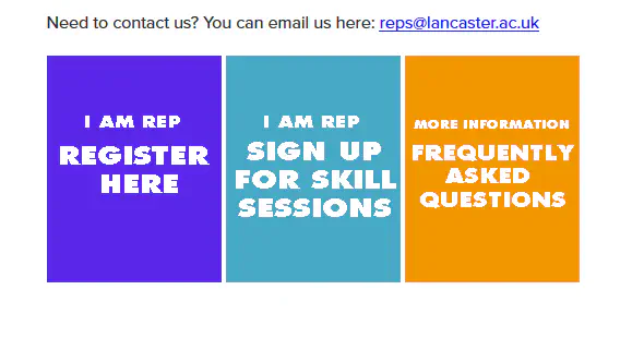
I mean, seriously? The orange is a bad clash, but at least it’s a bad clash consistently throughout the website. The turquoise too. But to stick in a different fucking shade of purple takes real balls.
Maybe this is a personal beef, but I’ve had a run-in before with a liberation officer who had a peculiar interpretation of what being an elected public position should entail. Item one is that you be publicly listed as holding that position so people can contact you.
So this works (until you click on a society and the whole top header disappears; see earlier):
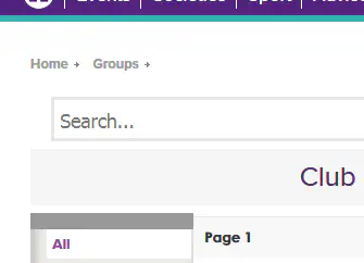
But then:
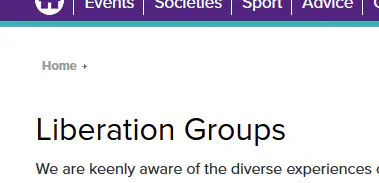

The Found a problem with the site?
button from which this article derives its title looks as though it was originally suppose to be on a LUSU purple background, rather than a white one, and thus sticks out like a sore thumb.